| 2.3. Диалоги и панели | ||
|---|---|---|

|
2. Главные окна |  |
| 2.3. Диалоги и панели | ||
|---|---|---|
|
|
2. Главные окна | |
GIMP has great flexibility for arranging dialog on your screen. A «dialog» is a moving window which contains options for a tool or is dedicated to a special task. A «dock» is a container which can hold a collection of persistent dialogs, such as the Tool Options dialog, Brushes dialog, Palette dialog, etc. Docks cannot, however, hold non-persistent dialogs such as the Preferences dialog or an Image window.
GIMP has three default docks:
the Tool Options dock under the Toolbox in the left panel,
the Layers, Channels, Paths and Undo dock in the upper part of the right panel,
the Brushes, Patterns and Gradients dock in the lower part of the right panel.
In these docks, each dialog is in its own tab.
In multi-window mode, the Toolbox is a utility window and not a dock. In single-window mode, it belongs to the single window.
Use → to view a list of dockable dialogs. Select a dockable dialog from the list to view the dialog. If the dialog is available in a dock, then it is made visible. If the dialog is not in a dock, the behavior is different in multi and single window modes:
In multi-window mode, a new window, containing the dialog, appears on the screen.
In single-window mode, the dialog is automatically docked to the Layers-Undo dock as a tab.
You can click-and-drag a tab and drop it in the wanted place:
either in the tab bar of a dock, to integrate it in the dialog group,
or on a docking bar that appears as a blue line when the mouse pointer goes over a dock border, to anchor the dialog to the dock.
In multi-window mode, you can also click on the dialog title and drag it to the wanted place.
Рисунок 3.7. Integrating a new dialog in a dialog group
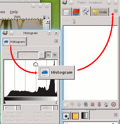
Here, in multi-window mode, the Histogram dialog was dragged to the tab bar of the Layers-Undo dock.
More simple: the Add tab command in the Tab menu Раздел 2.3.2, «Меню вкладок».
Рисунок 3.8. Anchoring a dialog to a dock border
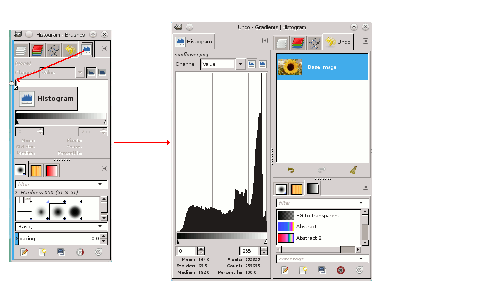
The Histogram dialog dragged to the left vertical docking bar of the right panel and the result: the dialog anchored to the left border of the right panel. This dialog now belongs to the right panel.
So, you can arrange dialogs in a multi-column display, interesting if you work with two screens, one for dialogs, the other for images.
![[Подсказка]](images/tip.png)
|
Подсказка |
|---|---|
|
Press the Tab key in an Image window to toggle the visibility of the docks. This is useful if the docks hide a portion of the image Window. You can quickly hide all the docks, do your work, then display all the docs again. Pressing the Tab key inside a dock to navigate through the dock. |
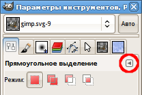
In each dialog, you can access a special menu of tab-related operations by pressing the Tab Menu button, as highlighted in the figure above. Exactly which commands are shown in the menu depends on the active dialog, but they always include operations for creating new tabs, closing or detaching tabs.
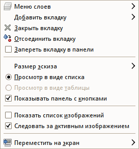
В меню вкладки представлены следующие команды:
At the top of each Tab menu, an entry opens the dialog's context menu, which contains operations specific to that particular type of dialog. For example, the context menu for the Layers tab is Layers Menu, which contains a set of operations for manipulating layers.
Добавить вкладку Этот пункт открывает вложенное меню, с помощью которого вы можете добавить прочие панели как новые вкладки.
Закрыть диалог. При закрытии последнего диалога закрывается вся панель.
Отделить диалог от панели, создавая новую панель с единственным отделённым диалогом. Это действие имеет тот же эффект, что и перетаскивание диалога за пределы панели в любую область экрана.
It's a way to create a paradoxical new window in single-window mode!
Если закладка заперта, это меню недоступно.
Заблокировать диалог от случайного перетаскивания или открепления. Если включено, пункт меню становится недоступным.
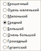
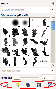
Большинство (но не все) диалогов содержит в меню вкладки пункт Размер эскиза, который раскрывает вложенное меню, предлагающее список размеров миниатюрной копии элементов в диалоге. К примеру, диалог кистей отображает рисунки всех доступных кистей: размер эскиза определяет, насколько крупными будут эти миниатюрные копии. По умолчанию значение размера — Средний.
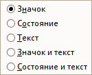
Этот элемент доступен, когда множество диалогов находится в одной панели: Стиль вкладок раскрывается во вложенное меню, позволяющее выбрать тип отображения вкладки (см. рисунок выше). Доступно пять вариантов (но не все варианты доступны для всех типов диалогов):
Использовать значок диалога для представления типа диалога.
Выбор этого пункта доступен только для диалогов, которые позволяют вам что-либо выбрать (кисть, шаблон, градиент и т.д.). Активный статус показывает текущий выбранный элемент.
Использовать текст для представления типа диалога.
При использовании значка и текста вкладки становятся шире.
Показывать текущий выбранный элемент и текст для представления типа диалога.
Эти пункты меню отображены в диалогах, которые позволяют вам выбрать элемент из списка: кисти, шаблоны, шрифты, и т.д. Вы можете выбрать способ отображения элементов: или в виде вертикального списка с именем рядом, или в виде таблицы, с отображением элемента, но без имени. Каждый имеет свои преимущества: просмотр в виде списка даёт вам больше информации, но просмотр в виде таблицы позволяет вам видеть больше элементов одновременно. Значение по умолчанию меняется в зависимости от диалога: для кистей и шаблонов значение по умолчанию это просмотр в виде таблицы, для большинства остальных это просмотр в виде списка.
When the tree-view is View as List, you can use tags. Please see Раздел 3.6, «Tagging».
You can also use a list search field:
Рисунок 3.14. Поле поиска в списке
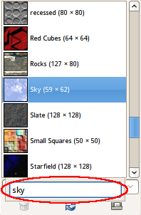
Use Ctrl+F to open the list search field. An item must be selected for this command to be effective.
Поле поиска в списке автоматически закрывается после пяти секунд бездействия.
![[Замечание]](images/note.png)
|
Замечание |
|---|---|
|
The search field shortcut is also available for the tree-view you get in the «Brush», «Font» or «Pattern» option of several tools. |
Некоторые диалоги показывают планку кнопок внизу диалога, например диалоги текстур, кистей, градиентов и изображений. Это переключатель. Если он отмечен, планка показывается.
This option is available in multi-window mode only. This is a toggle. If it is checked, then an Image Menu is shown at the top of the dock:
It is not available for dialogs docked below the Toolbox. This
option is interesting only if you have several open images on your
screen.
This option is available in multi-window mode only. This option is also interesting only if you have several images open on your screen. Then, the information displayed in a dock is always that of the selected image in the Image Selection drop-down list. If the Auto Follow Active Image is disabled, the image can be selected only in the Image Selection. If enabled, you can also select it by activating the image directly (clicking on its title bar).