| 5.2. Preferences Dialog | ||
|---|---|---|
 |
5. Misc dialogs |  |
| 5.2. Preferences Dialog | ||
|---|---|---|
| |
5. Misc dialogs | |
The preferences dialog can be accessed from the Toolbox menu, as → . It lets you customize many aspects of the way GIMP works. The following sections detail the settings that you can customize, and what they affect. This information applies specifically to GIMP 2.2, but the settings for GIMP 2.0 are similar enough that you should be able to understand them based on the explanations here.
All of the Preferences information is stored in a file called
gimprc in your personal GIMP directory, so
if you are a “power user” who would rather work with a
text editor than a graphical interface, you can alter preferences by
editing that file. If you do, and you are on a Linux system,
then man gimprc will give you a lot of
technical information about the contents of the file and what
they are used for.
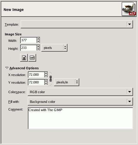
This tab lets you customize the default settings for the New Image dialog. See the New Image Dialog section for an explanation of what each of the values means.
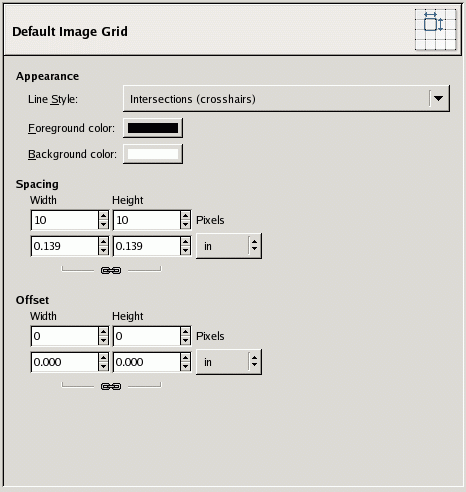
This page lets you customize the default properties of GIMP's grid, which can be toggled on or off using → from the image menu. The settings here match those in the Configure Image Grid dialog, which can be used to reconfigure the grid for an existing image, by choosing → from the image menu. See the Configure Grid dialog section for information on the meaning of each of the settings.
Figure 13.55. Assorted Interface Preferences
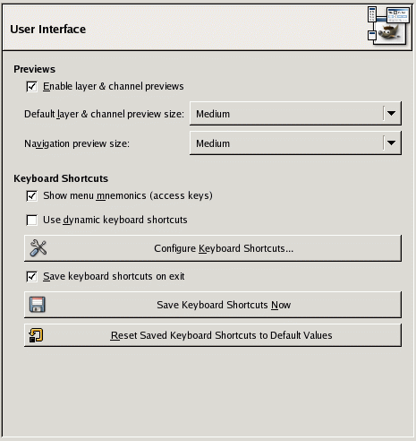
This page lets you customize layer/channel previews and keyboard shortcuts.
Options
By default, GIMP shows miniature previews of the contents of layers and channels in several places, including the Layers dialog. If for some reason you would prefer to disable these, you can do it by unchecking “Enable layer and channel previews”. If you do want previews to be shown, you can customize their sizes using the menus for “Default layer and channel preview size” and “Navigation preview size”.
Any menu item can be activated by holding down Alt and pressing a sequence of keys. Normally, the key associated with each menu entry is shown as an underlined letter in the text, called accelerator. If for some reason you would prefer the underlines to go away (maybe because you think they're ugly and you don't use them anyway), then you can make this happen by unchecking “Show menu mnemonics”.
GIMP can give you the ability to create keyboard shortcuts (key combinations that activate a menu entry) dynamically, by pressing the keys while the pointer hovers over the desired menu entry. However, this capability is disabled by default, because it might lead novice users to accidentally overwrite the standard keyboard shortcuts. If you want to enable it, check “Use dynamics keyboard shortcuts” here.
Pressing the button for “Configure Keyboard Shortcuts” brings up the Shortcut Editor, which gives you a graphical interface to select menu items and assign shortcuts to them.
If you change shortcuts, you will probably want your changes to continue to apply in future GIMP sessions. If not, uncheck “Save keyboard shortcuts on exit”. But remember that you have done this, or you may be frustrated later. If you don't want to save shortcuts on exit every session, you can save the current settings at any time using the “Save Keyboard Shortcuts Now” button, and they will be applied to future sessions. If you decide that you have made some bad decisions concerning shortcuts, you can reset them to their original state by pressing “Reset Saved Keyboard Shortcuts to Default Values”.
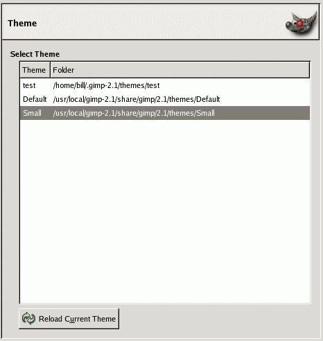
This page lets you select a theme, which determines many aspects of the appearance of the GIMP user interface, including the set of icons used, their sizes, fonts, spacing allowed in dialogs, etc. Two themes are supplied with GIMP: Default, which is probably best for most people, and Small, which may be preferable for those with small or low-resolution monitors. Clicking on a theme in the list causes it to be applied immediately, so it is easy to see the result and change your mind if you don't like it.
You can also use custom themes, either by downloading them from the
net, or by copying one of the supplied themes and modifying it.
Custom themes should be places in the themes
subdirectory of your personal GIMP directory: if they are, they
will appear in the list here. Each theme is actually a directory
containing ASCII files that you can edit. They are pretty
complicated, and the meaning of the contents goes beyond the scope
of this documentation, but you should feel free to experiment: in
the worst case, if you mess things up completely, you can always
revert back to one of the supplied themes.
You cannot edit the supplied themes unless you have administrator permissions, and even if you do, you shouldn't: if you want to customize a theme, make a copy in your personal directory and work on it. If you make a change and would like to see the result "on the fly", you can do so by saving the edited theme file and then pressing Reload Current Theme.
Figure 13.57. Help System Preferences (Linux Screenshot)
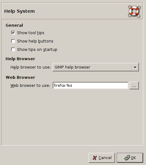
This page lets you customize the behaviour of the GIMP help system.
General
Tool tips are small text bubbles that appear when the pointer hovers for a moment over some element of the interface, such as a button or icon. Sometimes they explain what the element does; sometimes they give you hints about non-obvious ways to use it. If you find them too distracting, you can disable them here by unchecking this option. We recommend that you leave them enabled unless you are a very advanced user.
In GIMP 2.2, this options controls whether are shown the help buttons on every tool dialog, which may be used alternatively to invoke the help system.
Startup tips are helpful hints that appear each time you start GIMP. You can switch them on or off here. If you have switched them off by unchecking “Show tip next time GIMP starts” in the tip window, you can switch them back on by checking here. Whatever you decide to do, at some point you should take the time to go through the list of tips: they are considered to be very useful, and the things they tell you are not easy to discover by experimenting. If you prefer, you can read them at any time by choosing → in the Toolbox menu.
Help Browser
GIMP Help is supplied in the form of HTML files, i. e., web pages. You can view them using either a special help browser that comes with GIMP, or a web browser of your choice. Here you choose which option to use. Because the help pages were carefully checked to make sure they work well with GIMP's browser, whereas other web browsers are somewhat variable in their support of features, the safer option is to use the internal browser; but really any modern web browser should be okay.
![[Note]](../images/note.png)
|
Note |
|---|---|
|
Note that the help browser is not available on all platforms. If it is missing, the web-browser will be used to allow access to the help pages. |
Web Browser
If you selected “GIMP help browser” for the Help browser, this option has no effect. If you selected “Web browser”, you can decide here which browser to use, and how to invoke it, by entering the command that will be used to run the browser. The button to the right brings up a file selector, which you can use to locate the executable file for the browser if you like, but in most cases it is probably easier to enter a command by hand.
Figure 13.58. Tool Options Preferences
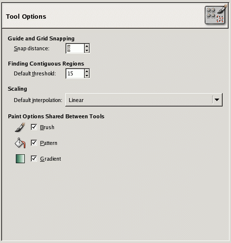
This page lets you customize several aspects of the behavior of tools.
Guide and Grid Snapping
"Snapping" to guides, or to an image grid, means that when a tool is applied by clicking somewhere on the image display, if the clicked point is near enough to a guide or grid, it is shifted exactly onto the guide or grid. Snapping to guides can be toggled using → in the image menu; and if the grid is switched on, snapping to it can be toggled using → . This preference option determines how close a clicked point must be to a guide or grid in order to be snapped onto it, in pixels.
Finding Contiguous Regions
The "magic wand" tool creates selections that consist of contiguous regions, i. e., regions that are not divided by swaths of open space. This option determines how near each other two pixels need to be in order to be considered contiguous.
Scaling
When you scale something, each pixel in the result is calculated by interpolating several pixels in the source. This option determines the default interpolation method: it can always be changed, though, in the Tool Options dialog. There are three choices:
None is fastest, but quite crude: you should only consider using it if your machine is very seriously speed-impaired.
Linear is the default, and is good enough for most purposes.
Cubic is the best (although it can actually look worse than Linear for some types of images), but also the slowest.
Paint Options Shared Between Tools
You can decide here whether changing the brush etc for one tool should cause the new item to be used for all tools, or whether each individual tool (pencil, paintbrush, airbrush, etc) should remember the item that was last used for it specifically.
Move tool
You can decide here whether changing the current level or path when using the move tool and without pressing any key.
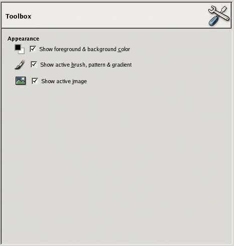
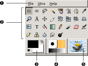
This page lets you customize the appearance of the Toolbox, by deciding whether the three "context information" areas should be shown at the bottom.
Appearance
Controls whether the color area on the left (3) appears in the Toolbox.
Controls whether the area in the center (4), with the brush, pattern, and gradient icons, appears in the Toolbox.
Controls whether a preview of the currently active image appears on the right (5).
Figure 13.61. General Image Window Preference
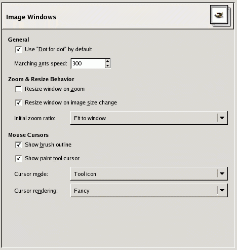
This page lets you customize several aspects of the behaviour of image windows.
General
Using "Dot for dot" means that at 1:1 zoom, each pixel is the image is scaled to one pixel on the display. If "Dot for dot" is not used, then the displayed image size is determined by the X and Y resolution of the image. See the Scale Image section for more information.
When you create a selection, the edge of it is shown as a dashed line with dashes that appear to move, marching slowly along the boundary: they are jokingly called "marching ants". The smaller the value entered here, the faster the ants march (and consequently the more distracting they are!).
Zoom and Resize Behavior
If this option is checked, then each time you zoom the image, the image window will automatically resize to follow it. Otherwise, the image window will maintain the same size when you zoom the image.
If this option is checked, then each time change the size of the image, by cropping or resizing it, the image window will automatically resize to follow. Otherwise, the image window will maintain the same size.
You can choose either to have images, when they are first opened, scaled so that the whole image fits comfortably on your display, or else shown at 1:1 zoom. If you choose the second option, and the image is too large to fit on your display, then the image window will show only part of it (but you will be able to scroll to other parts).
Mouse Cursors
If this option is checked, then when you use a paint tool, the outline of the brush will be shown on the image as you move the pointer around. On slow systems, if the brush is very large, this could occasionally cause some lag in GIMP's ability to follow your movements: if so, switching this off might help. Otherwise, you will probably find it quite useful.
If this is checked, a cursor will be shown. This is in addition to the brush outline, if the brush outline is being shown. The type of cursor is determined by the next option.
This option has no effect unless Show paint tool cursor is checked. If it is, you have three choices: Tool icon, which causes a small iconic representation of the currently active tool to be shown beside the cursor; Tool icon with crosshair, which shows the icon as well as a crosshair indicating the center of the cursor; or Crosshair only.
If you choose “Fancy” here, the cursor is drawn in grayscale. If you choose “Black and White”, it is drawn in a simpler way that may speed things up a little bit if you have speed issues.
Figure 13.62. Image Window Appearance Defaults
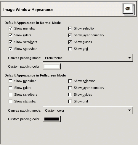
This page lets you customize the default appearance of image windows, for normal mode and for fullscreen mode. All of the settings here can be altered on an image-specific basis using entries in the View menu. See the Image Window section for information on the meaning of the entries.
The only parts that may need further explanation are the ones related to padding. “Padding” is the color shown around the edges of the image, if it does not occupy all of the display area (shown in light gray in all the figures here). You can choose among four colors for the padding color: to use the color specified by the current theme; to use the light or dark colors specified for checks, such as represent transparent parts of the image; or to use a custom color, which can be set using the color button for “Custom padding color”.
Figure 13.63. Image Window Title and Statusbar formats
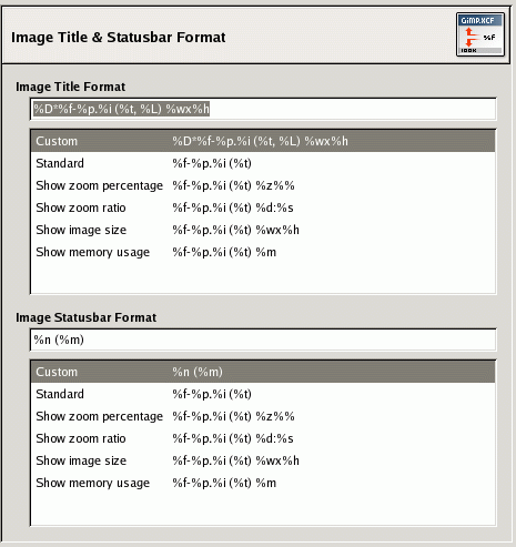
This page lets you customize the text that appears in two places: the title bar of an image, and the status bar. The title bar should appear above the image; however this depends on cooperation from the window manager, so it is not guaranteed to work in all cases. The statusbar appears underneath the image, on the right side. See the Image Window section for more information.
You can choose among several predesigned formats, or you can create one of your own, by writing a format string in the entry area. Here is how to understand a format string: anything you type is shown exactly as you type it, with the exception of variables, whose names all begin with "%". Here is a list of the variables you can use:
| Variable | Meaning |
|---|---|
| %f | Bare filename of the image, or "Untitled" |
| %F | Full path to file, or "Untitled" |
| %p | Image id number (this is unique) |
| %i | View number, if an image has more than one display |
| %t | Image type (RGB, grayscale, indexed) |
| %z | Zoom factor as a percentage |
| %s | Source scale factor (zoom level = %d/%s) |
| %d | Destination scale factor (zoom level = %d/%s) |
| %Dx | Expands to x if the image is dirty, nothing otherwise |
| %Cx | Expands to x if the image is clean, nothing otherwise |
| %l | The number of layers |
| %L | Number of layers (long form) |
| %m | Memory used by the image |
| %n | Name of the active layer/channel |
| %P | id of the active layer/channel |
| %w | Image width in pixels |
| %W | Image width in real-world units |
| %h | Image height in pixels |
| %H | Image height in real-world units |
| %u | Unit symbol (eg. px for Pixel) |
| %U | Unit abbreviation |
| %% | A literal "%" symbol |
Figure 13.64. Display Preferences
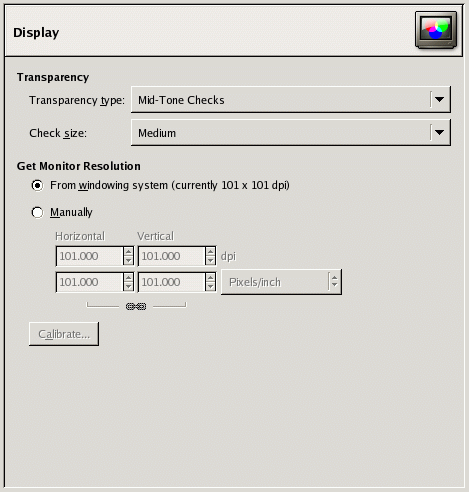
This page lets you customize the way transparent parts of an image are represented, and lets you recalibrate the resolution of your monitor.
Transparency
By default, GIMP indicates transparency using a checkerboard pattern with mid-tone checks, but you can change this if you want, either to a different type of checkerboard, or to solid black, white, or gray.
Here you can alter the size of the squares in the checkerboard pattern used to indicate transparency.
Monitor Resolution is the ratio of pixels, horizontally and vertically, to inches. You have three ways to proceed here:
Get Resolution from windowing system. (easiest, probably inaccurate).
Set Manually
Push the Calibrate Button.
My monitor was impressively off when I tried the Calibrate Dialog. The "Calibrate Game" is fun to play. You will need a soft ruler.
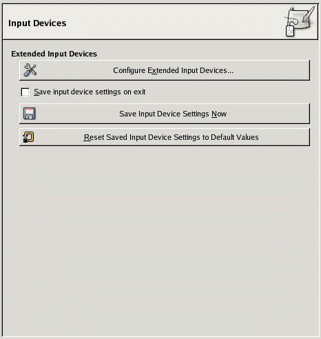
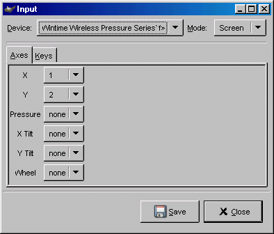
Extended Input Devices
This large button allows you to set the devices associated with your computer: tablet, MIDI keyboard... If you have a tablet, you will see a dialog like this:
When you check this box, GIMP remembers the tool, color, pattern and brush you were using the last time you quitted.
Self explanatory.
Delete your settings and restore default settings.
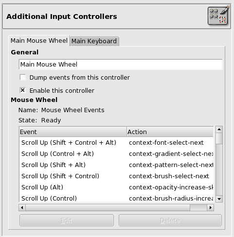
This dialog has two tabs that allow you to assign actions to the mouse wheel and to keyboard keys:
Main Mouse Wheel
Dump events from this controller: this option must be checked if you want a print on the stdout of the events generated by the enabled controllers. If you want to see those event you should start GIMP from a terminal or making it to print the stdout to file by the shell redirection. The main use of this option is for debug.
Enable this controller: this option must be checked if you want to add a new actions to the mouse wheel.
In this window with scroll bars you have: on the left, the possible events concerning the mouse wheel, more or less associated with control keys; on the right, the action assigned to the event when it will happen. You have also two buttons, one to the selected event, the other to the action of the selected event.
Some actions are assigned to events yet. They seem to be examples, as they are not functional.
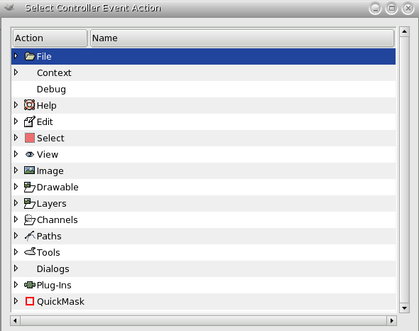
Afer selecting an event, if you click on the button, you open the following dialog:
If an action exists yet for this event, the window will open on this action. Else, the window will display the sections that order actions. Click on an action to select it.
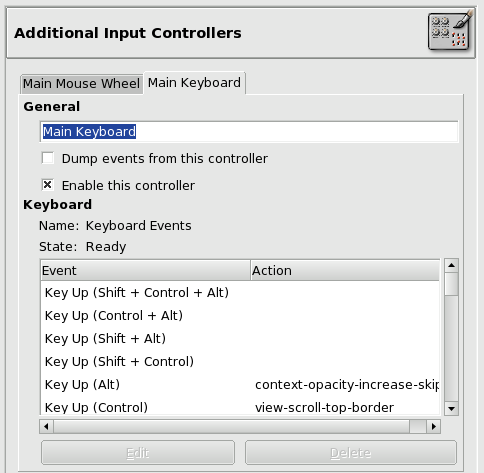
Main Keyboard
You can use this dialog in the same way as that of the mouse wheel. Events are related to the arrow keys of the keyboard, combined or not with control keys.
|
|
Note |
|---|---|
|
You will find an example of these notions in Creating a variable size brush . |
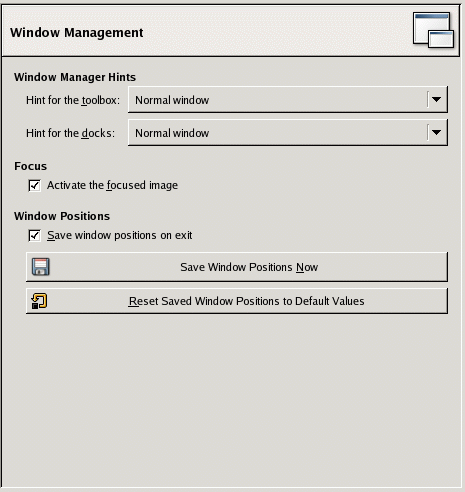
This page lets you customize the way windows are handled in GIMP. You should note that GIMP does not manipulate windows directly, instead it sends requests to the window manager (i. e., to Windows if you are running in Windows; to Metacity if you are running in a standard Gnome setup in Linux; etc). Because there are many window managers, and not all of them are well behaved, it cannot be guaranteed that the functions described here will actually work as described. However, if you are using a modern, standards-compliant window manager, they ought to.
Window Manager Hints
The choices you make here determine how the Toolbox, and the docks that hold dialogs, will be treated. If you choose "Normal Window", they will be treated like any other windows. If you choose "Utility Window", they will be raised into visibility whenever you activate an image window, and kept in front of every image window. If you choose "Keep above", they will be kept in front of every other window at all times. Note that changes you make here will not take effect until the next time you start GIMP.
Focus
Normally, when you focus an image window (usually indicated by a change in the color of the frame), it becomes the "active image" for GIMP, and therefore the target for any image-related actions you perform. Some people, though, prefer to set up their window managers such that any window entered by the pointer is automatically focused. If you do this, you may find that it is inconvenient for focused images to automatically become active, and may be happier if you uncheck this option.
Window Positions
If this option is checked, the next time you start GIMP, you will see the same set of dialog windows, in the same positions they occupied when you last exited.
This button is only useful if "Save window positions on exit" is unchecked. It allows you to set up your windows they way you like, click the button, and then have them come up in that arrangement each time you start GIMP.
If you decide that you are unhappy with the arrangement of windows you have saved, and would rather go back to the default arrangement than spend time moving them around, you can do so by pressing this button.
Figure 13.73. Environment Preferences
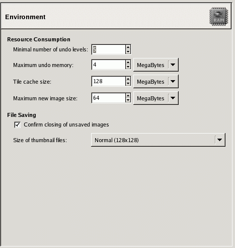
This page lets you customize the amount of system memory allocated for various purposes. It also allows you to disable the confirmation dialogs that appear when you close unsaved images, and to set the size of thumbnail files that GIMP produces.
Resource Consumption
GIMP allows you to undo most actions by maintaining an “Undo History” for each image, for which a certain amount of memory is allocated. Regardless of memory usage, however, GIMP always permits some minimal number of the most recent actions to be undone: this is the number specified here. See Section 3, “ Undoing ” for more information about GIMP's Undo mechanism.
This is the amount of undo memory allocated for each image. If the Undo History size exceeds this, the oldest points are deleted, unless this would result in fewer points being present than the minimal number specified above.
This is the amount of system RAM allocated for GIMP image data. If GIMP requires more memory than this, it begins to swap to disk, which may in some circumstances cause a dramatic slowdown. You are given an opportunity to set this number when you install GIMP, but you can alter it here. See How to Set Your Tile Cache for more information.
This is not a hard contraint: if you try to create a new image larger than the specified size, you are asked to confirm that you really want to do it. This is to prevent you from accidentally creating images much larger than you intend, which can either crash GIMP or cause it to respond verrrrrrrry slowwwwwwwwly.
Image Thumbnails
This options allows you to set the size of the thumbnails shown in the File Open dialog (and also saved for possible use by other programs). The options are “None”, “Normal (128x128)”, and “Large (256x256)”.
If an image file is larger than the specified maximum size, GIMP will not generate a thumbnail for it. This options allows you to prevent thumbnailing of extremely large image files from slowing GIMP to a crawl.
Saving Images
Closing an image is not undoable, so by default GIMP asks you to confirm that you really want to do it, whenever it would lead to a loss of unsaved changes. You can disable this if you find it annoying; but then of course you are responsible for remembering what you have and have not saved.
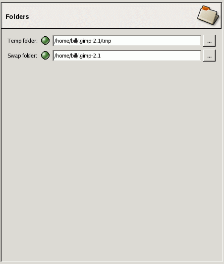
This page allows you to set the locations for two important folders used by GIMP for temporary files. The pages below it allow you to customize the locations searched for resources such as brushes etc.; see Data Folders for a description that applies to them. You can change the folders here by editing the entries, or by pressing the buttons on the right to bring up a file chooser window.
Folders
This folder is used for temporary files: files created for temporary
storage of working data, and then deleted within the same GIMP
session. It does not require a lot of space or high performance. By
default, a subdirectory called tmp
in your personal GIMP directory is used, but if that disk is very
cramped for space, or has serious performance issues, you can change
it to a different directory. The directory must exist and be
writable by you, or bad things will happen.
This is the folder used as a "memory bank" when the total size of images and data open in GIMP exceeds the available RAM. If you work with very large images, or images with many layers, or have many images open at once, GIMP can potentially require hundreds of megabytes of swap space, so available disk space and performance are definitely things to think about for this folder. By default, it is set to your personal GIMP directory, but if you have another disk with more free space, or substantially better performance, you may see a significant benefit from moving your swap folder there. The directory must exist and be writable by you.
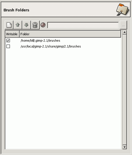
GIMP uses several types of resources – such as brushes, patterns, gradients, etc. – for which a basic set are supplied by GIMP when it is installed, and others can be created or downloaded by the user. For each such resource type, there is a Preference page that allows you to specify the search path: the set of directories from which items of the type in question are automatically loaded when GIMP starts. These pages all look very much the same: the page for brushes is shown to the right as an example.
By default, the search path includes two folders: a system folder, where items installed along with GIMP are placed, and a personal folder, inside your personal GIMP directory, where items added by you should be placed. The system folder should not be marked as writable, and you should not try to alter its contents. The personal folder must be marked as writable or it is useless, because there is nothing inside it except what you put there.
You can customize the search path with the buttons at the top of the dialog.
Options
If you click on one of the folders in the list, it is selected for whatever action comes next.
If you type the name of a folder in the entry space, or navigate to it using the file chooser button on the right, and then click the left button, this will replace the selected folder with the one you have specified. If nothing in the list is selected, the folder you specify will be added to the list. If the light-symbol to the left of the text entry area is red instead of green, it means that the folder you have specified does not exist. GIMP will not create it for you, so you should do this immediately.
If you click on the up-arrow or down-arrow buttons, the selected folder will be changed to the following or preceding one in the list. Since the folders are read in order, using those buttons change the loading precedence of the items located in those folders.
If you click the trash-can button, the selected folder will be deleted from the list. (The folder itself is not affected; it is merely removed from the search path.) Deleting the system folder is probably a bad idea, but nothing prevents you from doing it.