| 5.8. Curves | ||
|---|---|---|

|
5. Color Tools |  |
| 5.8. Curves | ||
|---|---|---|
|
|
5. Color Tools | |
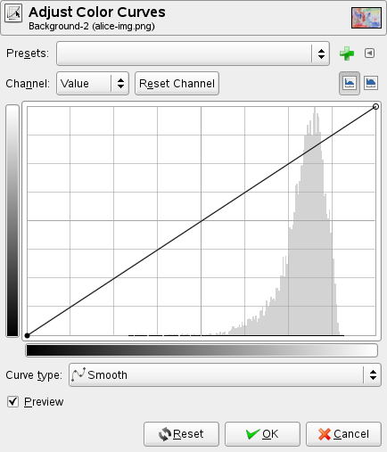
The Curves tool is the most sophisticated tool for changing the color, brightness, contrast or transparency of the active layer or a selection. While the Levels tool allows you to work on Shadows and Highlights, the Curves tool allows you to work on any tonal range. It works on RGB images.
You can get to this tool in several ways:
In the image menu through → → or → .
By clicking on the tool icon
 in Toolbox, if this tool has been installed there. For this, please
refer to Section 1.7, “Toolbox”.
in Toolbox, if this tool has been installed there. For this, please
refer to Section 1.7, “Toolbox”.
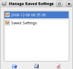
You can save the color settings of your image by clicking the
button

The
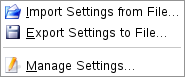
![]() button opens a menu:
button opens a menu:
which lets you Import Settings from File or Export Settings to File, and gives you access to the Manage Save Settings dialog:
There are five options:
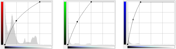
The curve represents the Value, i.e. the brightness of pixels as you can see them in the composite image.
The curve represents the quantity of color in each of the three RGB channels. Here, dark means little of the color. Light means a lot of the color.
The curve represents the opacity of the pixels. Dark means very transparent. Light means very opaque. Your image or active layer must have an Alpha channel for this option to be enabled.
This button deletes all changes made to the selected channel and returns to default values.
These buttons allow to choose the Linear or Logarithmic type of the histogram. You can also use the same options in Tool Options dialog. This grayed out histogram is not displayed by default.
The horizontal gradient: it represents the input tonal scale. It, too, ranges from 0 (black) to 255 (white), from Shadows to Highlights. When you adjust the curve, it splits up into two parts; the upper part then represents the tonal balance of the layer or selection.
The vertical gradient: it represents the destination, the output tonal scale. It ranges from 0 (black) to 255 (white), from Shadows to Highlights.
The chart: the curve is drawn on a grid and goes from the bottom left corner to the top right corner. The pointer x/y position is permanently displayed in the top left part of the grid. By default, this curve is straight, because every input level corresponds to the same ouput tone. GIMP automatically places an anchor at both ends of the curve, for black (0) and white (255).
If you click on the curve, a new anchor is created. When the mouse pointer goes over an anchor, it takes the form of a small hand. You can click-and-drag the anchor to bend the curve. If you click outside of the curve, an anchor is also created, and the curve includes it automatically.
Unactive anchors are black. The active anchor is white. You can activate an anchor by clicking on it. You can also swap the anchor activation by using the Left and Right arrow keys of your keyboard. You can move the anchor vertically with the Up and Down arrow keys. This allows you to fine tune the anchor position. Holding the Shift down lets you move it by increments of 15 pixels.
Two anchors define a curve segment which represents a tonal range in the layer. You can click-and-drag this segment (this creates a new anchor). Of course, you can't drag it beyond the end anchors.
To delete all anchors (apart from both ends), click on the Reset Channel button. To delete only one anchor, move beyond any adjacent anchor on horizontal axis.
Meanwhile, on the canvas, the mouse pointer has the form of an eye-dropper. If you click on a pixel, a vertical line appears on the chart, positioned to the source value of this pixel in the selected channel. If you Shift-click, you create an anchor in the selected channel. If you Ctrl-click, you create an anchor in all channels, possibly including the Alpha channel. You can also Shift-drag and Ctrl-drag: this will move the vertical line and the anchor will show up when releasing the mouse left button.
The histogram of the active layer or selection for the selected channel is represented grayed out in the chart. It's only a reference.
This the default mode. It constrains the curve type to a smooth line with tension. It provides a more realistic render than the following.
With this mode, you can draw a broken line that you can smooth by clicking the button again.
The Preview button makes all changes to the levels dynamically so that the new level settings can be viewed immediately.
Tool Options dialog
Although this tool is not present in the Toolbox by default (For this, please refer to Section 1.7, “Toolbox” if you want to add it), nevertheless it has a Tool Option Dialog under the Toolbox. These options are described here:
These two options have the same action as the Logarithmic
 and Linear
 buttons in the Curves dialog.
This slider sets the “radius” of the color-picking area. This area appears as a more or less enlarged square when you maintain the click on a pixel. Here, the eye-dropper is used to locate a pixel: radius = 1 seems the best.
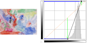
We create anchors and segments on the curve and we move them to shape the curve. This curve maps “input” tones of the active layer or selection to “output” tones.
Moving the anchor of a pixel upwards makes this pixel brighter.
Moving the anchor upwards
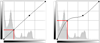
Making the curve more horizontal forces all the input tonal range to occupy a shrunk output tonal range.
The histogram shows the compression of pixels into the output range. Darkest and brightest pixels disappeared: contrast decreases.
Figure 14.172. Making the curve more horizontal
Make the curve more horizontal
The resulting histogram
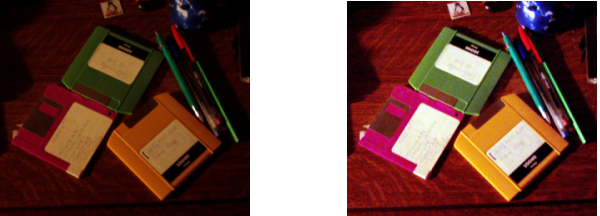
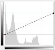
Moving the upper end point to the left and the lower end point to the right is the same as moving the white slider to the left and the black slider to the right in the Levels tool: all pixels whose value is more than the white point (the flat part of the curve) are made white (more colored / more opaque according to the selected channel). All pixels whose value is less than the black point (the lower flattened curve) are made black (black / completely transparent). Pixels corresponding to points of the curve that have moved up are made lighter. Pixels corresponding to points of the curve that have moved down are made darker (green arrows). All these pixels will be extended to the whole output tonal range.
The histogram shows the extension of values, from black (0) to White (255): contrast is increased. Since the Value channel is selected, changes affect all color channels and colors increase.
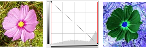
Inverted curve
Black is made White (fully colored / fully opaque). White is made black (black, fully transparent). All pixels adopt the complementary color. Why that? Because subtracting the channel values from 255 gives the complementary color. For example: 19;197;248 a sky blue gives 255-19; 255-197; 255-248 = 236;58;7, a bright red.
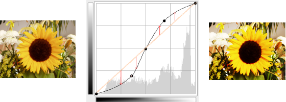
Contrast enhanced
Contrast is increased in mid tones because the curve is steeper there. Highlights and Shadows are increased but contrast is slightly less in these areas because the curve is flatter.